Mahāmudrā | Singularity in type design
- Brian Saul
- Jul 31, 2024
- 2 min read

Updated: Aug 27, 2024

Typeface: Mahāmudrā; Classification: geometric, monospace, sans serif, display; Styles: wide, square; Weight: heavy, thin; Inspiration: Mahāmudrā
And now for something completely different.
Type design never comes out of nothing. Inspired by the great seal of Tibetan and Indian Buddhism, Mahāmudrā is the point beyond which duality dissolves and singularity emerges. All ritual, morality and dogma cease to be relevant. It's the unification of matter and consciousness – “not self”. Form is emptiness, emptiness is form.
Lofty goal for a font I guess! But in fact it kinda represents the synthesis of my working and my spiritual life. Generally speaking I'm not a huge fan of statements like "type design (insert the interest or vocation of your choice) is my meditation" but for me, both deliver flow, and flow cam be a great foundation for insight.
The best definition of flow I've come across came from my friend Judy Brooks. She says "Understanding your needs and talents and being able to meet your own needs by utilizing your own talents within any given situation or environment."
To me flow is the state of being engaged in something you are good at while having all of all of my emotional, intellectual and spiritual needs met by that activity itself. Nothing to do, nothing to be, nothing to know. Just pure desireless action, where time melts away. Not quite sigularity, but close.
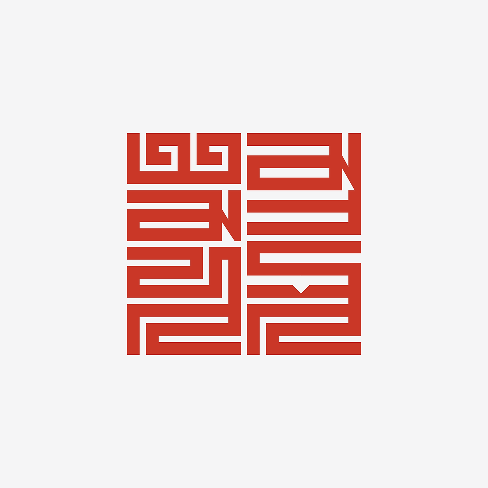
The Mahāmudrā seal itself, contains the words “maha” and “mudra” in 12th century 'Phags-pa script (Tibetan Mongolian ) is deceptively simple. What appears at first to conform to a 12x12 grid (4 glyphs of 3 rules) is actually 11x11 , with 2 of 4 glyphs sharing a common rule, all of which forming a perfect square.
A little less dramatically, within the seal exists the possibility of a latin alphabet that is best suited to top to bottom, left to right reading. I'll be checking in frequently with seal. I'm hoping to end up with a font that will allow me to set a latin alphabet version of the great icon.
So with nothing less than singularity as inspiration and a vertical reading font as the goal, off I go.