Knowledge Slab | Font design | Geometric vs. old style
- Brian Saul
- Aug 7, 2024
- 2 min read

Updated: Aug 27, 2024

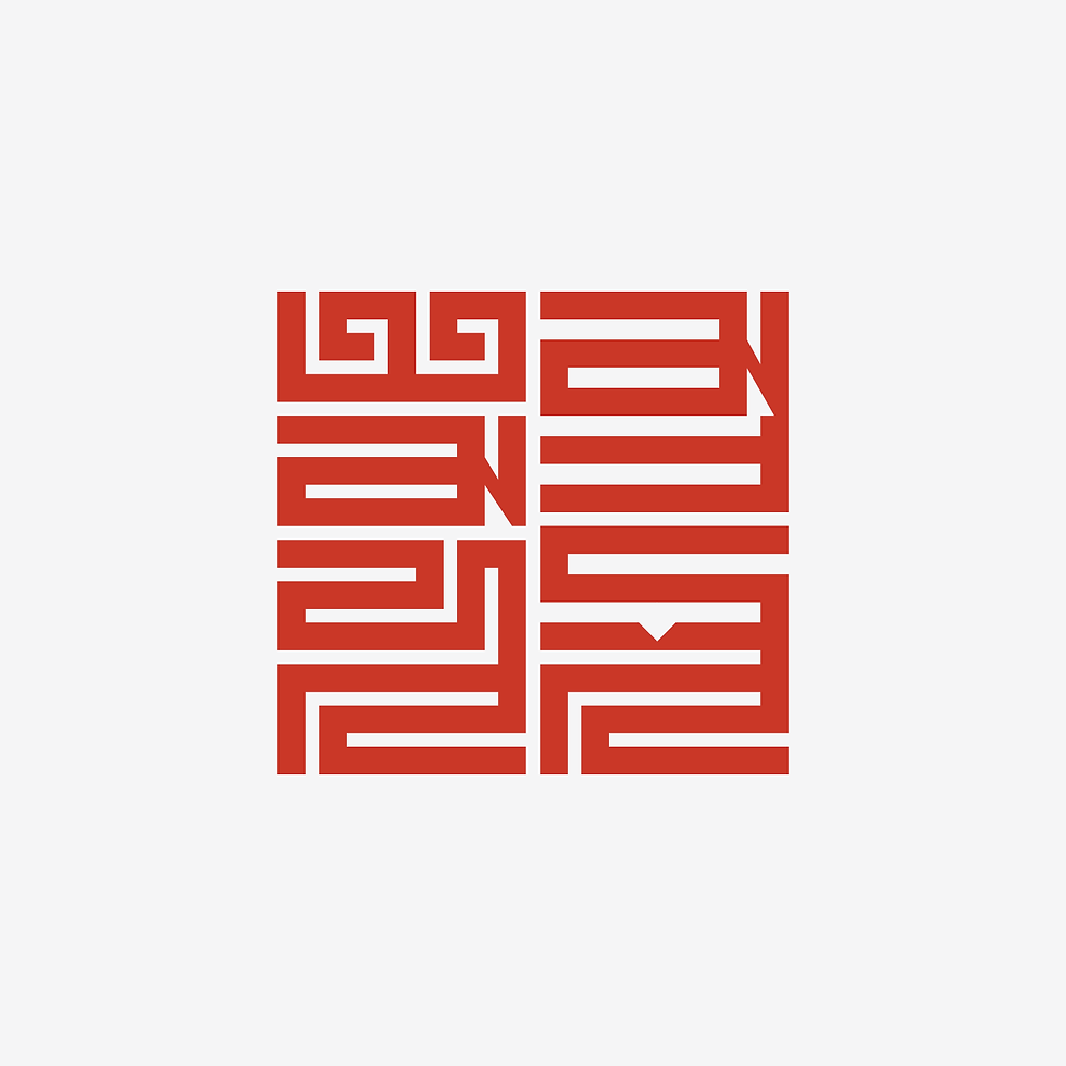
Typeface: Knowledge; Classification: slab serif; Styles: roman, italic Weights: thin, regular, bold Inspiration: Archer, Rockwell, Beton
Lowercase “n” is alway a challenge for me because of my inclination toward a geometric vs humanist approach. Knowledge slab is no different. Because I’m not naturally a very strong illustrator, the non-symetrical curved lines/shapes always give me pause and make me feel a bit like a fraud.
In typographical terms “geometric” refers to abandoning traditional forms in favor a more mathematical approach. Mostly they are sans serifs like Futura, Avant Garde and Gotham. Slab serif fonts like Beton and Rockwell are typically monoline - all stokes are basically the same width, and typically serifs are not bracketed. Modern examples like Archer break the rules by using two story lowercase “a” and reintroducing ball terminals.
Generally speaking when I refer to my work as “geometric” what I mean is everything adds. There is a logical solution that can be measured and repeated (most of the time). No magical strokes of the pen that make all your problems go away.
As far as "Nn" goes, the uppercase “N” is comfortable, everything lines up, but the lower-case n always feels like trial and error. An entirely geometric approach feels inauthentic and not quite right, and a freehand line just seems imprecise and messy.
The lowercase ”n’ feels like I'm leaving my comfort zone, but the good news is once it lands, “m” is relatively easy. “Ss” on the other hand is a whole new world of anxiety and imposter syndrome.
(Not?) coincidentally I'm not particularly drawn to italics either. Like old-style letters in general they feel frivolous, not in a good way. I guess I'm a pretty straight up and down kinda guy. But I like the way Knowledge italic is shaping up.
Perhaps I will be won over by frivolity.